Is Civ 7's UI as Bad as They Say?
Is Civilization VII's UI Really That Bad? A Critical Assessment

Civilization VII's Deluxe Edition debuted recently, and online discussions are already buzzing about its user interface (UI) and other shortcomings. But is the UI truly as flawed as many claim? This analysis dissects the game's UI elements to determine if the criticism is justified.
← Return to Sid Meier's Civilization VII main article
Assessing Civ 7's UI: A Critical Look
Early opinions on Civ VII, especially its UI, have been mixed. While it's easy to join the chorus of complaints, a more objective evaluation is needed. We'll examine the UI's components to see if it meets the standards of a functional 4X game interface.
What Defines a Successful 4X UI?
While some argue for objective 4X UI design principles, the reality is more complex. A UI's effectiveness depends on the game's context, style, and goals. However, design experts have identified common elements of successful 4X UIs. Let's use these elements to evaluate Civ VII's UI.
Information Hierarchy and Accessibility
A good UI prioritizes essential information. Frequently used resources and mechanics should be readily accessible, while less crucial features can be accessed with minimal clicks. The UI shouldn't display everything at once, but it should organize information logically.
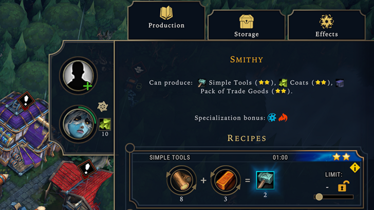
Against the Storm's building info menus serve as a strong example. Each building's menu is tabbed, prioritizing common actions (worker assignment, production) while placing less frequent functions in separate tabs.
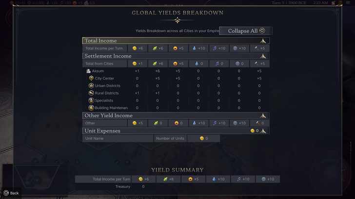
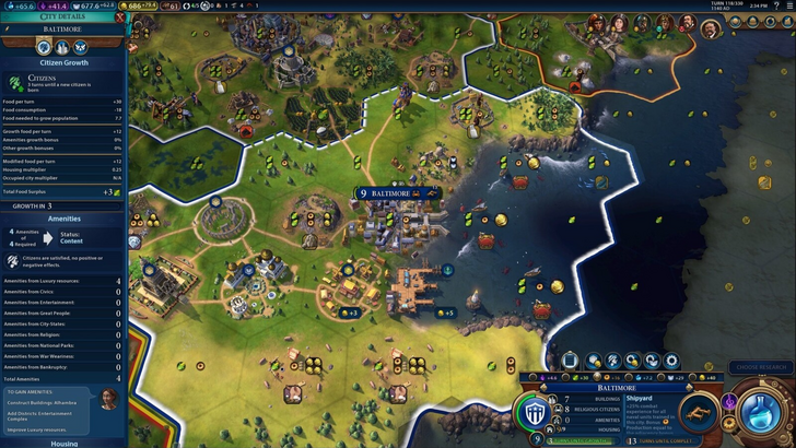
Civ VII's resource summary displays resource allocation, separating income, yields, and expenses. It's well-structured and collapsible. However, it lacks granular detail. While overall resource generation from districts is shown, the specific district or hex isn't identified. Expense breakdowns are also limited. The UI functions, but greater specificity would improve it.
Visual Indicators: Clarity and Efficiency
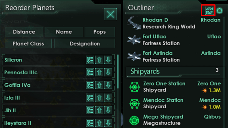
Effective visual indicators convey information quickly using icons, colors, or overlays, reducing reliance on text. Stellaris' Outliner, despite its cluttered main UI, effectively uses icons to show ship status (transit, scanning, etc.).
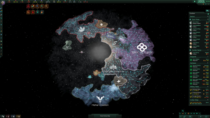
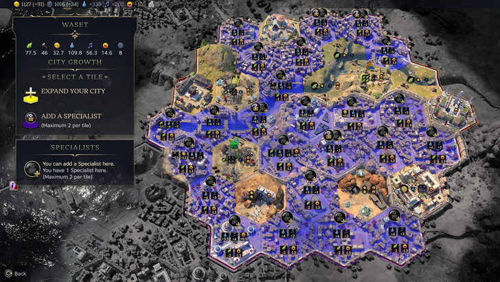
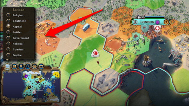
Civ VII uses iconography and numerical data for resources. The tile yield overlay, settlement overlay, and settlement expansion screen are visually informative. However, the absence of certain lenses from Civ VI (appeal, tourism, loyalty) is a drawback, as is the lack of customizable map pins. While not terrible, there's room for improvement.
Search, Filtering, and Sorting
As complexity increases, search, filtering, and sorting become crucial. Civ VI's robust search function allows players to locate resources, units, etc., on the map. Its Civilopedia also links entries to in-game elements.
Civ VII lacks this crucial search function, a significant usability issue. The absence of this feature is a major drawback given the game's scale. Hopefully, Firaxis will address this in future updates.
Design and Visual Consistency
The UI's aesthetic and cohesiveness are critical. Civ VI's dynamic, cartographical style complements the game's art and enhances the overall experience.
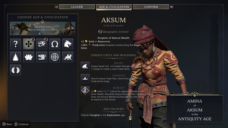
Civ VII adopts a minimalist, sleek design. The color palette (black and gold) is sophisticated but less visually striking than Civ VI. This more subtle approach has resulted in mixed reactions, highlighting the subjective nature of visual design.
The Verdict: Not as Bad as Advertised
While Civ VII's UI isn't perfect, the criticism is overblown. The missing search function is a significant flaw, but not game-breaking. Compared to other issues, the UI's shortcomings are relatively minor. While it lacks the visual flair of some competitors, it's functional and has strengths. With updates and player feedback, it can improve significantly.
← Return to Sid Meier's Civilization VII main article
Sid Meier's Civilization VII Similar Games


-
1
Every Pokémon Game on the Nintendo Switch in 2025
Feb 25,2025
-
2
Stardew Valley: A Complete Guide To Enchantments & Weapon Forging
Mar 17,2025
-
3
Roblox: Trucking Empire Codes (January 2025)
Mar 05,2025
-
4
![Anime Vanguards Tier List – Best Units For Each Gamemode [UPDATE 3.0]](https://images.gzztb.com/uploads/35/17376012656791b0f12fa1c.jpg)
Anime Vanguards Tier List – Best Units For Each Gamemode [UPDATE 3.0]
Feb 27,2025
-
5

Poring Rush, the casual battling spin-off from hit MMORPG Ragnarok Online, is out now
Dec 30,2024
-
6
Ragnarok X: Next Gen - Complete Enchantment Guide
May 25,2025
-
7
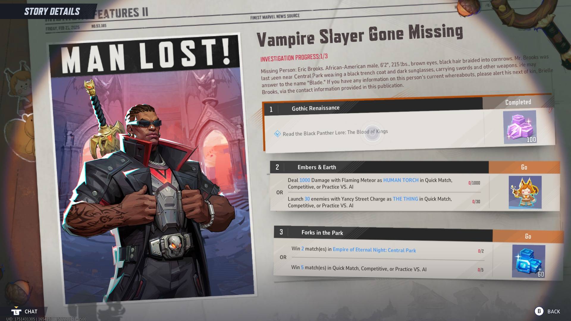
How To Read Black Panther Lore: The Blood of Kings in Marvel Rivals
Mar 01,2025
-
8
Nvidia RTX 5090 Specs Leak: Rumor Confirmed?
Mar 14,2025
-
9
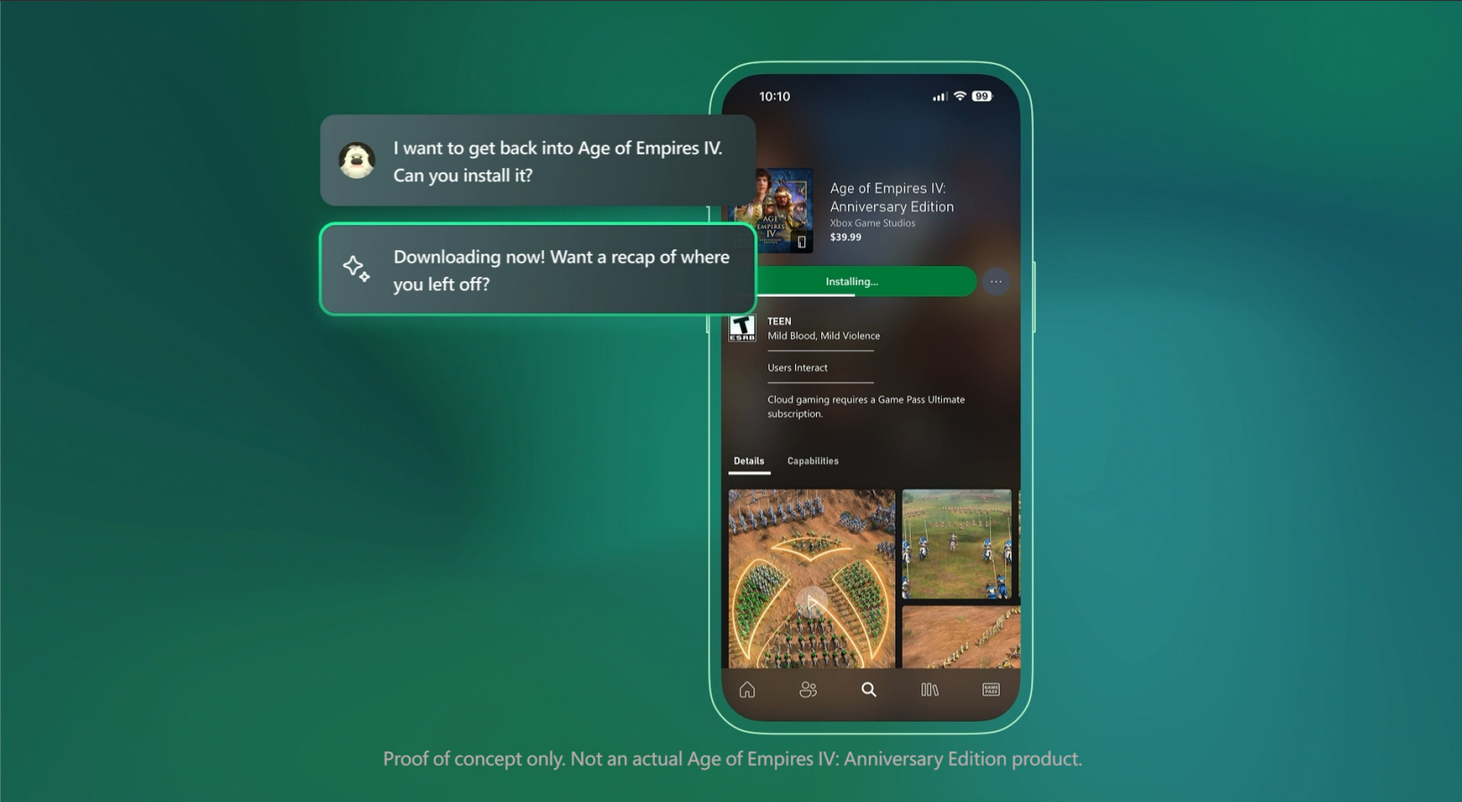
Microsoft to Integrate Copilot AI into Xbox App and Games
May 21,2025
-
10
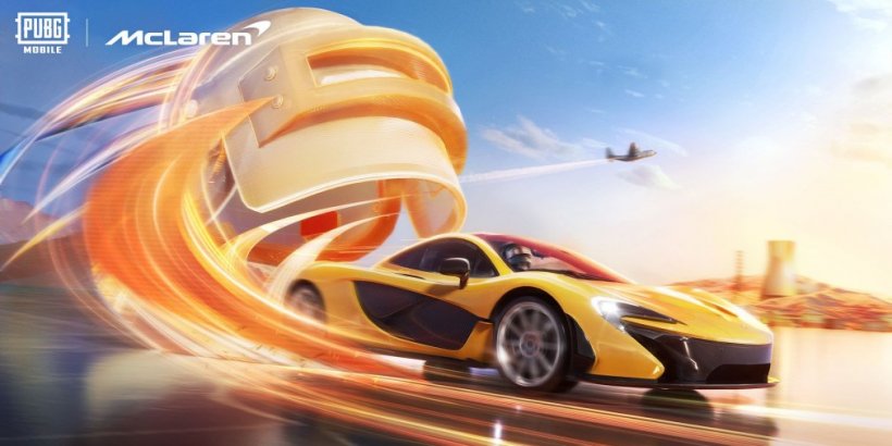
McLaren Returns to PUBG Mobile Collaboration
Aug 27,2024
-
Download

The Golden Boy
Casual / 229.00M
Update: Dec 17,2024
-
Download

Niramare Quest
Casual / 626.43M
Update: Feb 21,2023
-
Download
POW
Casual / 38.00M
Update: Dec 19,2024
-
4
Mother's Lesson : Mitsuko
-
5
Gamer Struggles
-
6
How To Raise A Happy Neet
-
7
Poly Pantheon Chapter One V 1.2
-
8
Dictator – Rule the World
-
9
Strobe
-
10
Maersk