Anwendungsbeschreibung:
Thank you for the information!
This tool is designed to help designers, developers, and content creators ensure that their color choices are accessible to people with color vision deficiencies (CVD), such as deuteranopia, protanopia, and tritanopia.
Here’s a quick guide to using the application effectively:
🎨 How to Use the Color Contrast & Accessibility Tool:
-
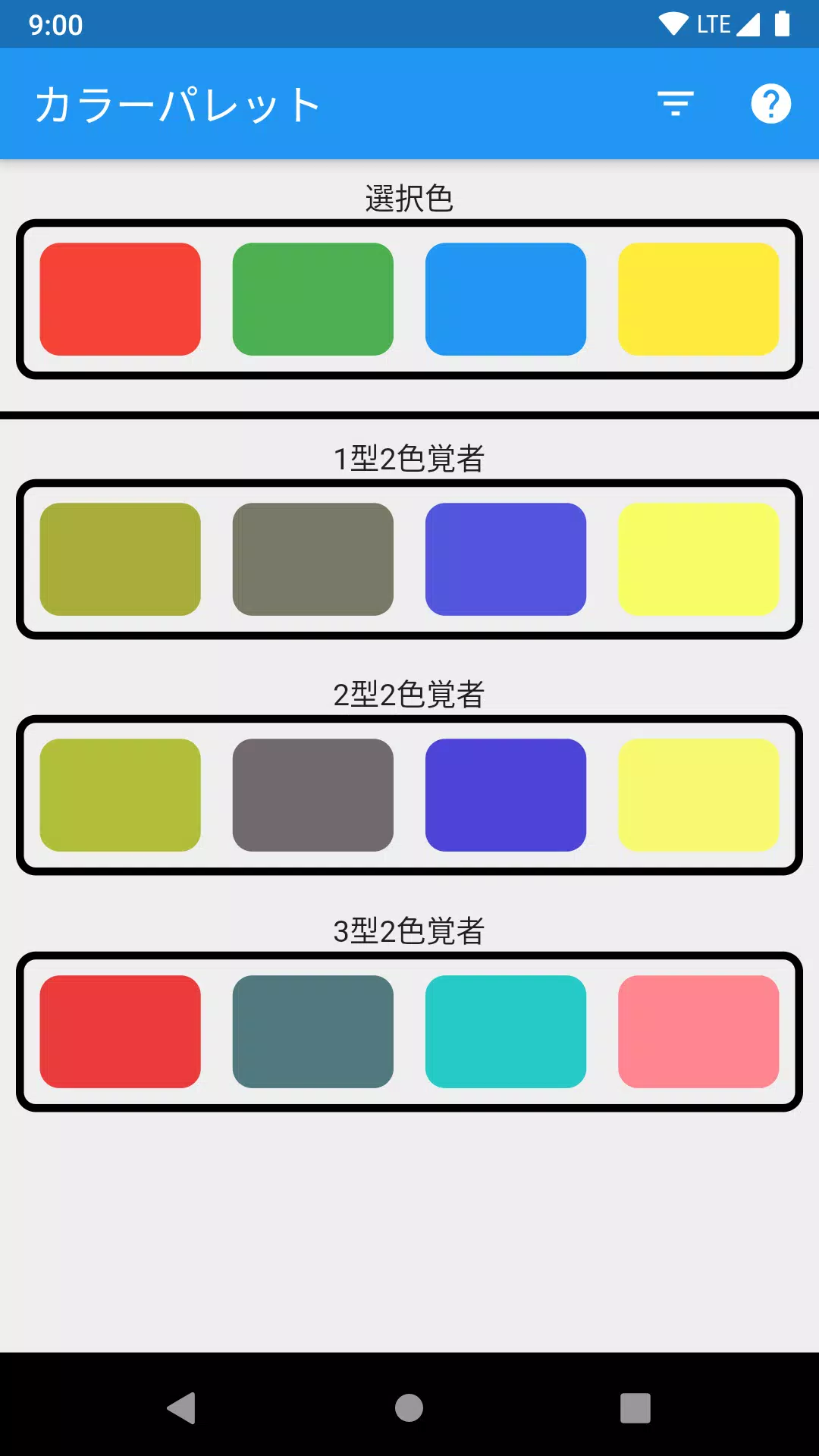
Select Colors
- Use the color picker(s) to choose up to four colors you want to evaluate.
- You can input colors by name, hex code, RGB, or HSL values.
-
Compare Visibility
- The tool will display how each color appears under different types of color blindness:
- Deuteranopia (most common – green-red confusion)
- Protanopia (red-green confusion)
- Tritanopia (blue-yellow confusion)
- Achromatopsia (complete color blindness – grayscale view)
- The tool will display how each color appears under different types of color blindness:
-
Evaluate Distinctiveness
- Check if your selected colors remain distinguishable when simulated through CVD filters.
- Colors that blend together or appear similar under CVD should be adjusted for better accessibility.
-
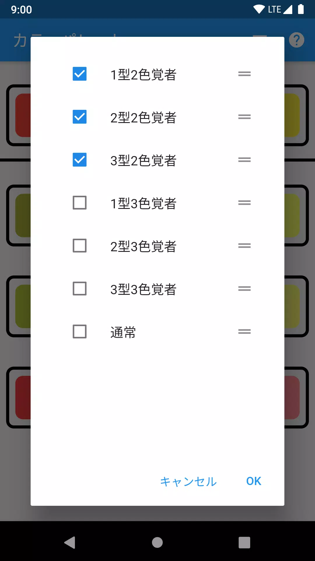
Use the Help Icon (?)
- Click the "?" in the top-right corner for step-by-step instructions, tips on choosing accessible palettes, and best practices (e.g., using sufficient contrast, avoiding red-green combinations, testing with real CVD simulations).
-
Best Practices for Accessible Color Use:
- ✅ Use tools like this to test before finalizing designs.
- ✅ Pair color with patterns, textures, or labels (e.g., using arrows or icons along with color).
- ✅ Ensure sufficient contrast (minimum 4.5:1 for normal text, 3:1 for large text).
- ✅ Test with actual CVD simulations, not just assumptions.
💡 Pro Tip: Always test your final design using real CVD simulation tools or browser extensions like "CVD Simulator" or "Color Oracle."
Let me know if you'd like help:
- Choosing accessible color combinations
- Interpreting simulation results
- Fixing problematic color pairs
You're doing great by prioritizing inclusivity! 🌈
Bildschirmfoto
App-Informationen
Ausführung:
1.0.2
Größe:
18.4 MB
Betriebssystem:
Android 4.1+
Entwickler:
xxllxx
Paketnamen
xxl.lxx.colormatch
Verfügbar auf
Google Pay
Rezensionen
Kommentar schreiben


Beliebte Apps


Software-Ranking